
IF YOU ARE HERE FOR THE DREAMWEAVER "JULY TO DIE FOR" POST, PLEASE SCROLL DOWN TO THE NEXT POST.

 The technique of masking in art can have a couple of purposes. It can aid you in creating a background by masking away the fore-ground. This can be accomplished by creating a second version on scrap paper, or even better, sticky notes. Cut this secondary piece out, place it over the original to mask that off from whatever you decide to add to the background. I'm sure that at least a few of our ladies on the Woodware team will be demonstrating this during our challenge week of "Masking". My version is a bit different.
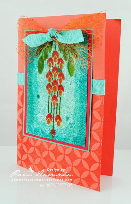
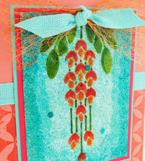 Sometimes you create a focal panel that you love, but it's just missing something. That was my problem with the Dreamweaver Hanging Wisteria design above. I had used stencil brushes and a palette of ink to color and shade. I was happy enough with the design, but just wanted to showcase it a bit more. I wanted a bit of visual texture as well. I wanted a bit of spray and spatter. But that can be tricky over the top of something else. Too easy to overspray and completely cover your original design. Here is where masking comes into play.
I tore a portion of a sticky note on all sides, slightly smaller than the original panel, and centered it over the design. Then I used my ink mist in aqua, just once over the surface. I removed the "mask", and tore more paper around the edge to make the mask smaller, and placed it over the design once again. And sprayed, just once. This time, I removed the mask entirely, and misted over the entire panel, design and all, just once. This final one added a fine texture and pale color without overwhelming the design. The previous two sprays and maskings, provided a bit of an ombré look, and at the same time, framed the wisteria design...truly making it the focal point.
The card was finished with a card base with the Dreamweaver Cathedral Window stencil letter-pressed into the surface...also a form of masking as the ink is only on the stencil, and then pressed into the surface of the cardstock, leaving the rest of the design "masked".
I hope that you have fun playing with all the ways that you can add masking to your art. Remember to check back on the Woodware blog each day for more inspiration!

3 comments:
Awe...so sweet. I would like this as a Christmas card. thanks, -con
This is a really pretty card. Love the color combination.
A very clever card. Beautiful colours. I love the way you have added the graduation of colour.
Post a Comment